If you are somewhat happy with your CV, but feel that an extra touch is missing even, we got you!
The change you are looking for might just be in the design. Let us show you 4 things you can do to improve the look and feel of your CV.
Tip 1: The two column format
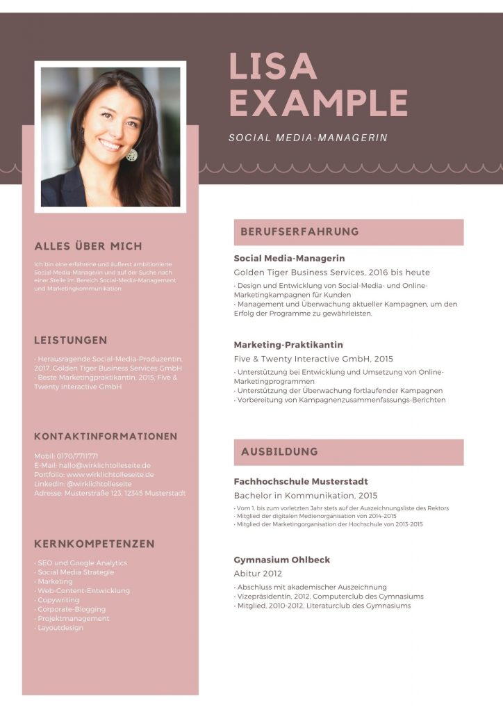
Is your CV a one-pager with text flowing from beginning to end? This is not wrong – but if you divide your CV into two columns, you create a visual change that has a big impact on the readers perception.
On top, you’ll have more space so you can fit your CV more easily on just one page. Try it out!

Example of a two column CV from canva.com
Tip 2: Your Picture
Adding a professional and smiling picture of yourself will make your CV stand out. This has a psychological reasoning: We as humans are social beings and connect with others.
An additional tip here you can use is to make your picture a little bigger. The closer the picture is to the person viewing it, the more connection you actually create.
Tip 3: Add some colour
It will make a difference to use colours in your CV. But make sure those colours are not too crazy and also fit the industry you are applying to. You can use colours in your text (e.g., to highlight the headers) or as background of your CV.
A spicy tip for you: You can use the colours of the company you are applying to. This will definitely stand out for the recruiter looking at them.
Tip 4: Replacing words with icons
As a recruiter you have to scan through a high amount of text in minum time. And to read through a lot of words tires the eye.
That is why you can help the recruiter by replacing certain words with icons (of course only where applicable). Some examples are icons of a phone, email, LinkedIn, etc.
We hope these tips help you. Happy redesigning of your CV!


